Featured in

- Published 20260203
- ISBN: 978-1-923213-16-6
- Extent: 196pp
- Paperback, eBook, PDF

The team at GR HQ had some thought-provoking conversations while selecting the cover art for Griffith Review 91: On the Money. Of course, there are obvious symbols that convey this evergreen theme – bulging wads of cash, a bank, gold bullion – but these felt like low-hanging fruit. In the age of Amazon, online shopping and next-day delivery, how could we represent contemporary commerce? This question led us to Peter Bakacs, whose bold, vivid paintings of industrial and consumer goods have been widely exhibited across Australia, the US and Japan. Griffith Review Editor Carody Culver recently sat down with Bakacs to talk about his career trajectory, his unassuming subjects and his love of mid-century design.
CARODY CULVER: You’ve got a background in fine art – I understand that you studied ceramic design at Monash and focused on clay. What made you switch creative gears and start working with paint? And why is acrylic in particular your paint of choice?
PETER BAKACS: I started out studying graphic design, then fell into ceramic design by accident. After that, I moved into multimedia and majored in 2D animation. Painting just grew out of that. A lot of the animations I was making were heavily influenced by Looney Tunes and ’60s car culture. Acrylic ended up being the perfect fit for my style because I love that flat, graphic look.
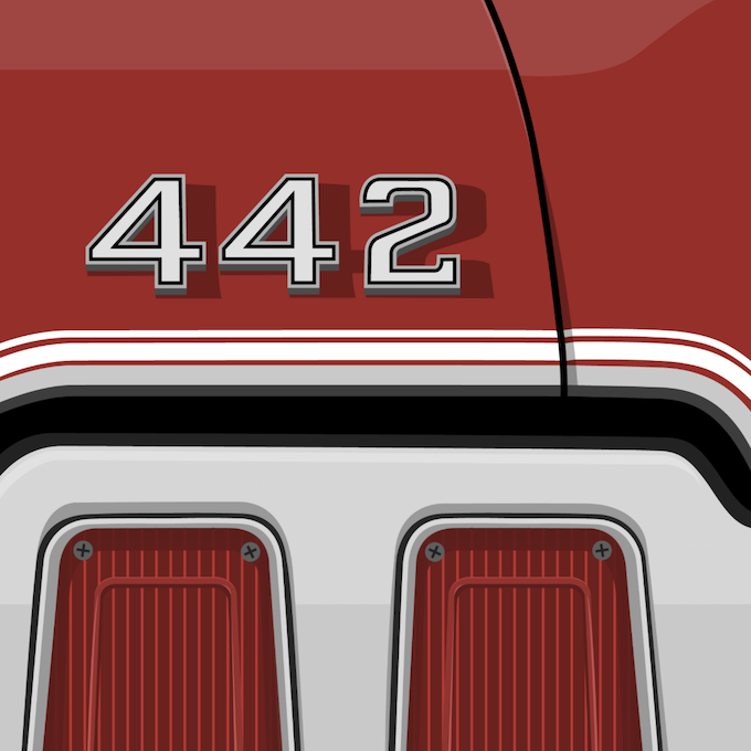
CC: Your earlier paintings featured striking mid-century-style characters alongside vintage cars and auto parts, whereas your recent work feels more abstract: the cars are still there, but you also paint industrial elements, such as the shipping containers that grace the cover of Griffith Review 91; and you often have cropped compositions, zooming in on details such as a speedometer or a manufacturer logo. What led you in this direction?
PB: Initially, characters from my animations began to spill over into my wider work. However, I found myself becoming increasingly interested in the finer details of objects, whether a car or an industrial machine. I’m drawn to elements that most people might not look at twice. I began focusing on these overlooked details – for example, a speedometer. Someone likely spent days, weeks or even years refining its functionality and design. It’s that level of thought, precision and craftsmanship that I find truly fascinating.

CC: Your work has such a bold, pop-infused aesthetic, with bright colours and sharp, clean lines. I love the contrast between your style and the mechanical and industrial objects in your paintings! What draws you to capture these quotidian subjects with such vibrancy and joy?
PB: I want to champion these objects, proving that even a bumper bar, wheel or shipping container can be beautiful and worthy of celebration in a painting. I believe vibrant colour and crisp lines help achieve this.
CC: You’re a web designer as well as a painter. Do these two lines of work inform or complement each other?
PB: They definitely complement each other. While the subject matter and mediums are very different, both practices rely on composition, balance and intentional design. Spending eight hours a day crafting digital experiences and then creating container compositions on canvas feels like two expressions of the same creative instinct.

CC: From 2007 to 2020, you and your partner, Trish Callan, ran the incredible website and Instagram account ‘Modernist Australia’, which documented beautifully maintained mid-century houses across the country. What appeals to you about mid-century design, and to what extent do you think this aesthetic influences your art?
PB: We both grew up in and around mid-century homes: Trish in her family home, and me in my grandparents’ home. We’ve always loved the aesthetics and practicality these houses embody. They feel welcoming and calm; they’re made to be lived in. I should add that I was simply the web designer behind Modernist Australia; it’s very much Trish’s creation. For me, mid-century design is defined by its no-nonsense, minimalist approach to art and architecture, something that has stayed with me, unwaveringly, since childhood.
Share article
About the author

Peter Bakacs
Peter Bakacs is a painter and designer based in Victoria, Australia. His acrylic works draw on a lifelong fascination with vintage vehicles, industrial landscapes,...
More from this edition

Undisclosed funds
Introduction IN 2022, THE American culture writer Jordan Calhoun penned a column in The Atlantic that I still think about. In his piece, Calhoun recalls...

Libretti
Poetry You spend your Centrelink payment on a dinner package to the opera. Madama Butterfly. You rent a suit, tie, waistcoat, black, black, black, starched...
The landlord’s son
Fiction THE LANDLORD’S SON arrived unannounced, just before dinner. Mia saw him from the window as he crossed the paddock from his own house. Passing...
