Featured in

- Published 20260203
- ISBN: 978-1-923213-16-6
- Extent: 196pp
- Paperback, eBook, PDF
In the eye-catching paintings of Sydney-based artist Rebecca Trajkovski, wealth has never looked so good: from the clean lines of her mid-century mansions to the sharp lapels of her dapper besuited gentleman, these artworks conjure a retro fantasy of rich living that seems too flawless to be true. And that’s the point: Trajkovski’s Aspirational series depicts a world of insatiable desire for material goods that symbolise success and that promise the kind of elusive happiness only a marketing executive would take at face value. In this conversation with Griffith Review Editor Carody Culver, Trajkovski shares the creative influences and impulses she brings to her art.
CARODY CULVER (CC): You’re a self-taught artist and a practising lawyer – I imagine those are two very different professional spheres! How do they inform and complement one another?
REBECCA TRAJKOVSKI (RJ): On the surface, they seem totally different, but I’ve realised how much they actually complement each other. My legal work can be intense and structured, so painting has always been a way to decompress. It helps me process things and think more creatively. When I’m painting, I get that sense of space and focus that’s hard to find in a busy workday. It’s my reset button.
At the same time, I draw a lot of inspiration from the world of law: the people, the language, the hierarchy, the culture of control. So much of my work and the stories behind it are fuelled by those experiences. In a way, my art is where I get to question the systems I work within every day.
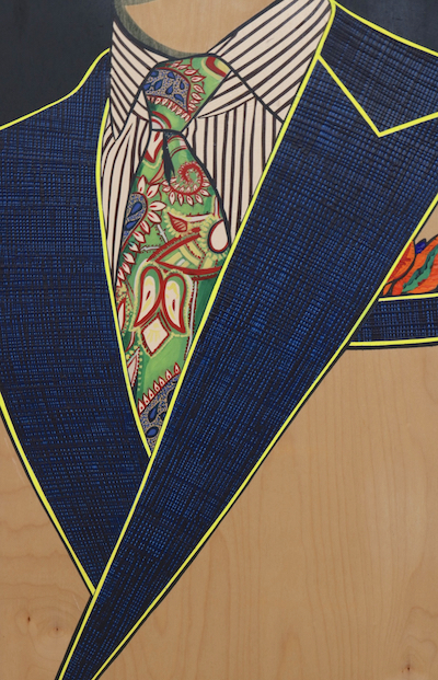

L – If Only Life could Be as Neat as This Ensemble (2022) acrylic on birch, 63 x 43 cm
R – If I Have Control Over My Aesthetic I Have Control Over My Life (2022), acrylic on birch, 63 x 43 cm
CC: The works we’re featuring in this edition of Griffith Review are from your Aspirational series: bold, brightly coloured paintings of immaculate mid-century houses, snappily dressed businessmen and various other symbols of a materially plentiful life. This series explores, in your words, ‘the wanting mind’. What draws you to this theme? Has your creative practice changed the way you conceptualise the notion of aspiration?
RJ: I’ve definitely got a wanting mind: I want it all, and I wanted it all yesterday. I’m not ashamed to admit that, but I’ve also seen how easily it can spiral when you’re constantly comparing where you are and what you have with everyone else. The paintings are a way of holding up a mirror to that mindset. They’re reminders to keep perspective.
Maybe creating instead of consuming is what keeps me grounded. There’s something deeply satisfying about making something with your hands and seeing it connect with someone else. That exchange feels real in a world that’s always pushing us to want more.
CC: These works have a striking, pop art–like sensibility that gives them a tantalising sense of heightened reality, almost as though they’re too good to be true. This illusory quality is amplified by your playful and ironic titles, such as If I Have Control Over My Aesthetic I Have Control Over My Life and No. 4 Struggle Street. What are you examining here about the relationship between imagination and reality?
RJ: Haha! Yes, they’re definitely too good to be true! I’m really interested in why we want these things. I know I’m personally drawn to clever marketing – the kind that makes you think, ‘If only I had that thing, maybe then I’d feel complete’, or ‘Once I get it, maybe the wanting will stop.’ But, of course, once we’re in that loop, it’s never enough. As soon as the package arrives, we’re already craving the next fix.
Visually, the paintings have that heightened sense of reality, too. I use a colour called ‘storm blue’, a deep navy that’s the shade of the sky just before a thunderstorm. It feels like the void, a kind of charged stillness before something breaks. It ties the whole Aspirational series together. In No. 4 Struggle Street, for example, the designer home floats like a dream to aspire to, but it’s surrounded by this dark atmosphere.
I also paint on birch panels so the natural wood grain shows through – a quiet reminder of what’s real beneath the surface. I like that tension between the real and the manufactured – not only within the artwork, but as a reflection of the world we live in.
CC: Many of these paintings have a mid-century aesthetic, from the modernist architecture of If You Have This House You Will Be Happy to the ’60s-style suit jacket in If Only Life Could Be as Neat as This Ensemble. What’s the connection for you between this retro style and the notion of aspiration?
RJ: As a child of the ’80s, growing up through the ’90s and 2000s, I feel a definite pull towards and connection to nostalgic and retro items. I’ve always loved the simplicity and timelessness of mid-century design: the architecture, the furniture, the colours. There’s such confidence and joy in it.
These days, it feels like a lot of us lean towards minimalist decor and white walls, but earlier generations were so much bolder and more playful. I’ll admit I’ve got white walls, too, but with new artworks constantly rotating, it keeps things interesting and lets me show a bit of personality.
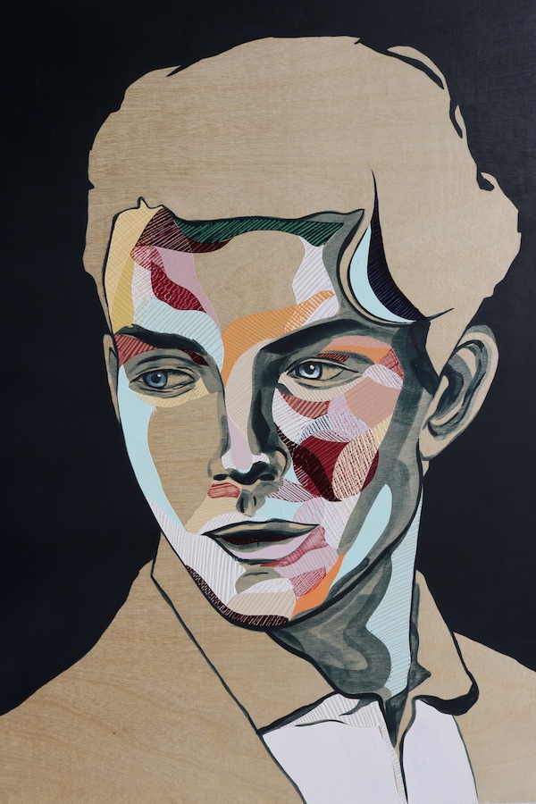
L – The Board Series 17, No.2 of 13 (2022), acrylic on board, 45 x 55 cm
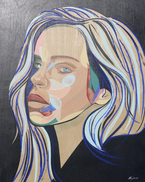
R- The Board Series 20, No. 1 of 3 (2024), acrylic on board, 45 x 55 cm
CC: Your long-running The Board series features beautiful but inscrutable human faces; I understand that this series was inspired by your experience of working in a very corporate, male-dominated industry. How has this series evolved over the years, and how does this evolution reflect your changing relationship to your legal career?
RJ: About eight years ago, I started The Board series when I was pregnant with my first son. I was on maternity leave, and the company I worked for was going through a big restructure. Around the same time, my husband took a new job that was supposed to be based in Sydney but ended up being two and a half hours north. So, I spent those months travelling back and forth with a newborn, painting in hotel rooms while he slept.
At the time, I didn’t really know what the faces meant or why I was making them; I just knew I loved it. It was playful and grounding, a creative outlet in the middle of a chaotic chapter. Looking back, I think those early faces were about power, the people behind corporate decisions that affect lives they’ll never really touch.
Over time, though, the series has evolved. I’ve realised it’s also about the masks we all wear, especially in professional environments. For years, I kept my creative side hidden from my legal world, and my legal career hidden from the art world. Even things like DJ-ing, I kept separate.
Now, I see The Board as being about self-discovery. That journey towards becoming your authentic self. Maybe that’s why the series is still ongoing: the person in the painting, like me, is never fully formed. We’re both still learning and growing.
CC: I’m struck by the nature of the non-human subjects in these paintings, too – many pieces feature racing cars or music paraphernalia. What do these subjects represent to you?
RJ: While I was studying, and even during the early years of my legal career, I used to DJ. I’ve always loved music: I think it’s one of the greatest art forms, as a song can instantly change your mood and bring joy. It still does that for me. I’ve still got my DJ set-up in the living room, ready for random sessions with my kids.
I’ve also noticed a cultural shift lately. More people are DJ-ing, and it’s becoming this desirable, creative lifestyle that fits neatly into the aspirational aesthetic I explore in my paintings. Club culture itself has evolved, too. There’s this new wave of ‘soft clubbing’ happening, raves at cafés in the morning where people dance and drink coffee instead of alcohol. I love it. It feels like a celebration of creativity and connection but in a healthier, more conscious way.
As for the cars, that comes from my dad. He’s always loved them. We used to go to the motor show every year in the ’90s, and he’d fix up and resell cars, so there were always different ones around: BMWs, Mercedes, Audis, Alfas, Peugeots. His love of design and detail definitely rubbed off on me. I still turn my head when a beautiful car drives past. And, of course, they fit perfectly into the aspirational world I paint, symbols of success, desire and style.
CC: What’s your next project?
RJ: There’s something very exciting in the works. For quite some time, I’d been playing with the idea of bringing creativity into the corporate world, which gave rise to Studio 529 – a platform that offers creative workshops designed to help professionals in fast-paced or analytical roles tap into creativity and reconnect, with themselves, their ideas and each other.
My aim is to blend playfulness and mindfulness in a relaxed and engaging space. The creative arts were my escape, and I’m passionate about sharing the benefits of art to a wider audience.
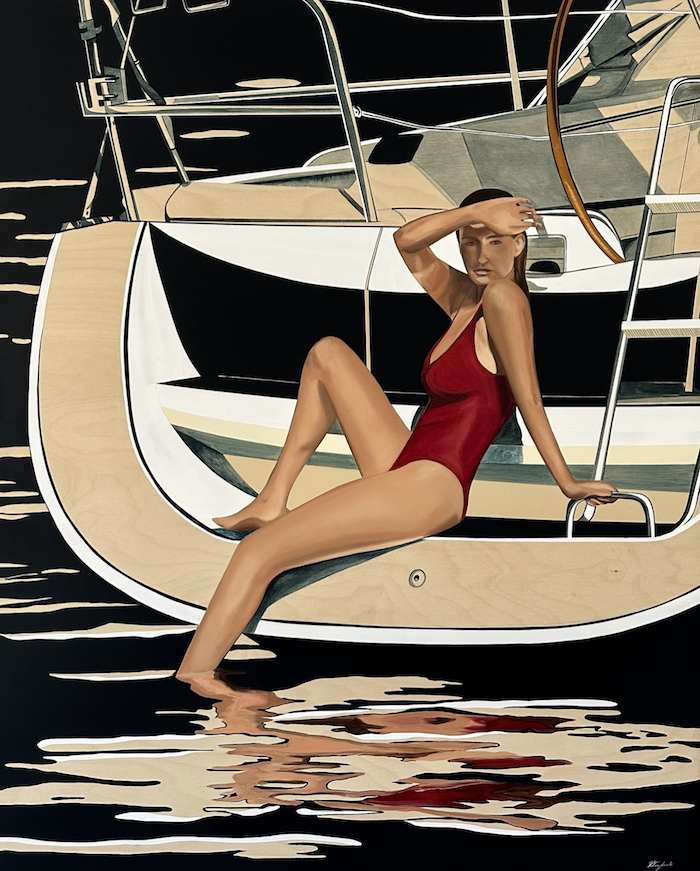
Main image: Rebecca Trajkovski My Milkshake Brings All the Boys to the Yacht (2023), acrylic and oil on birch, 93 x 113 cm
Share article
About the author
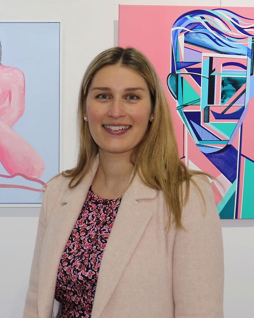
Rebecca Trajkovski
Rebecca Trajkovski is a self-taught artist, a mother and a practising lawyer based in Sydney. She’s won the Local Artist Prize in the Georges River Art Prize (2019) and the People's Choice Award in the Law...
More from this edition
Operator, please
Non-fiction OVER THE LAST few years, I’ve started to do volunteer work for a number of national and international companies. It started off quite slowly....

Finer details
GR Online The team at GR HQ had some thought-provoking conversations while selecting the cover art for Griffith Review 91: On the Money. Of course, there...
The cost of living
Non-fiction The key is to read along and against the archive grain, to shed light on these records, interrogate their origins, and activate some awakening...
