Notes from a Sunshine City
Sketching the surreal in suburbia
Featured in
- Published 20250204
- ISBN: 978-1-923213-04-3
- Extent: 196 pp
- Paperback, ebook. PDF
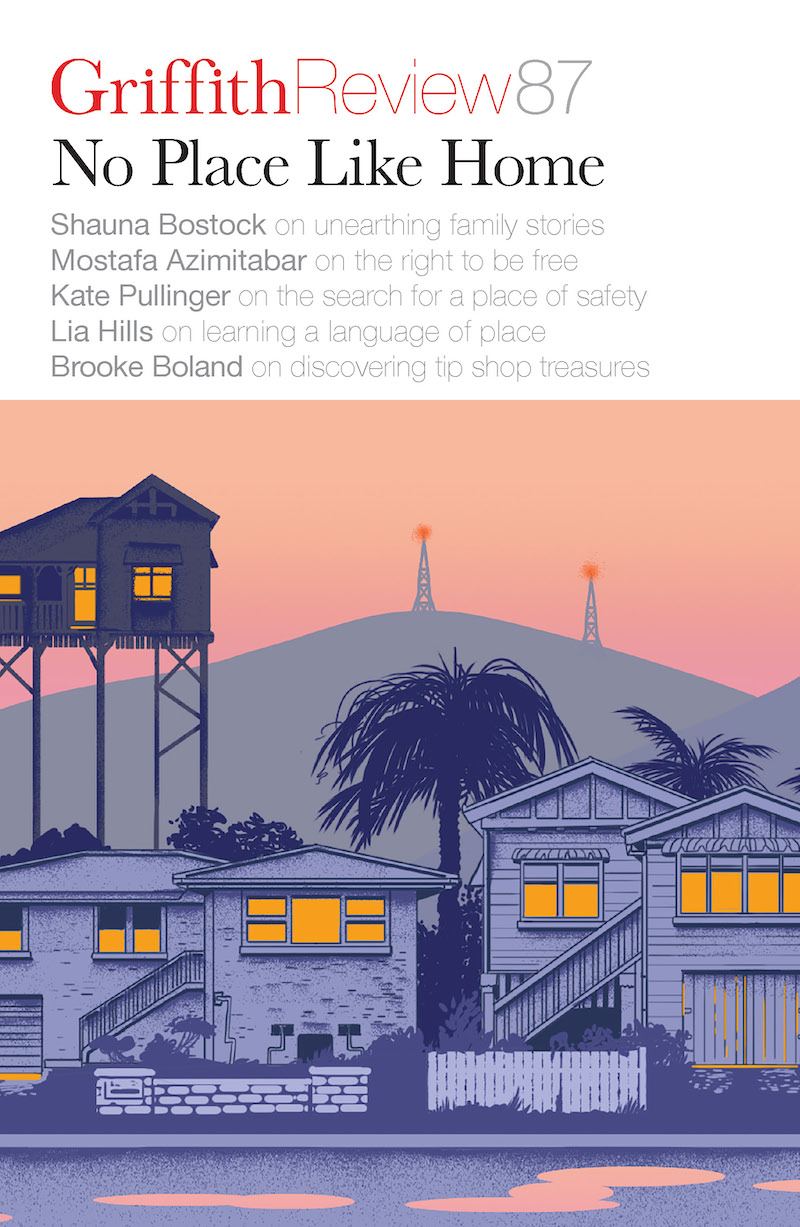
Subtropical surreal, the artwork adorning the cover of Griffith Review 87: No Place Like Home, features a dreamy suburban streetscape of timber houses and palm trees in the golden hour of sunset. It’s a characteristically Brisbane scene, but its playful colour palette – deep pink sky, purple houses and pools of peachy light – lend the tableau a gently surreal quality that’s also characteristic of its artist, the multi-talented and multidisciplinary Phoebe Paradise. In this conversation, Griffith Review Editor Carody Culver talks to Phoebe about how her artwork embodies and expands her relationship with the city both she and Griffith Review call home.
CARODY CULVER: You’re also a musician and designer, and much of your early commercial illustration work revolved around the music world – you created record covers, gig flyers and merch. How would you characterise the relationship between your music and your art? Have these different spheres of your creative practice influenced one another?
PHOEBE PARADISE: This is such a great question, thank you! Many contemporary artists I know really found their community and place in the world during their years at university, and this is maybe the closest comparison I have to my time playing in bands and touring in my early twenties. Much of my audience, friendships and commercial networks came from this world and seriously shaped me and the type of work I produced from early on in my career – in subject matter but also in a bit of punk hubris (ha!) that allowed me to keep experimenting and pushing myself into new projects.
CC: South-East Queensland, and Brisbane/Meanjin in particular, seem central to your work. Alongside your illustrations, you also ran a shop in Fortitude Valley from 2017–19 that sold your fashion label and doubled as a venue for gigs, exhibitions and more. Has your creative practice changed the way you relate to, and engage with, the city (particularly its cultural life)?
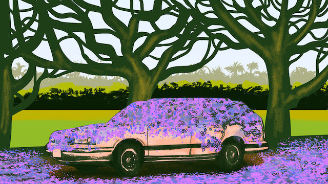
PP: Gosh, absolutely. I think you can pinpoint exactly which Brisbane suburb I’m living in (and the subsequent version of myself from that time) based on the kinds of illustrations I produce: during the Fortitude Valley/Paradise the Label years, everything was cigarette butts and hangovers; 2020–23 was a kind of Northern Suburbs apocalypse; and now I’m in South Brisbane, walking along the river under the jacarandas. Maybe that means the city impacts my creative practice more than the other way around!
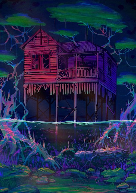
CC: The cover of No Place Like Home is a detail from Subtropical surreal, an incredible animated projection you created for Brisbane City Council (BCC) for their Outdoor Gallery Program in 2021. The full work depicts several Queenslander houses against a backdrop of distant, pylon-dotted hills and a peach-coloured summer-evening sky – a classic suburban Brisbane vibe! Were you re-creating houses you’ve lived in or visited, or did you conjure these from your imagination?
PP: Thank you so much for the kind words – it was such an honour to have this work accepted in the BCC’s permanent collection as their first ever digital acquisition! A big moment for me. I think the timing of the commission was instrumental to my relationship with this imagery. Subtropical surreal was commissioned smack bang in the middle of the Covid lockdown in 2020, when everyone was feeling stuck and clawing at the walls of their own homes. I feel like our collective relationships with The House™ as a motif changed so much during that time; the housing crisis, lockdown and climate apocalypse were looming large all at once. Personally, I developed this kind of bizarre voyeuristic relationship with the suburbs and houses I passed on my mandated mental-health walks. While my share house in the Valley was quickly deteriorating from lockdown stress, these little daily walks were an oasis where I would find myself overcome with the sublime beauty of utterly nothing views: dilapidated Queenslander houses, vines growing through stormwater pipes, well-loved gardens… I think I was subconsciously seeking to reframe the feeling of being trapped and instead transform my small world into something bigger and weirder and more beautiful.
CC: I feel very nostalgic when I look at Subtropical surreal, even though I’ve never lived in a Queenslander. Were you seeking to evoke particular emotions in viewers when you created this artwork?
PP: What I really wanted for Subtropical surreal was this feeling of quaint observation in an otherwise magical world, and how our eyes play tricks on us when we let our imagination linger, especially as children. Much like the walks I mentioned – taking these little quiet moments to explore the world around you and stretching those visuals out into something fantastical. I want people to see what I see, or at least learn to look for it.
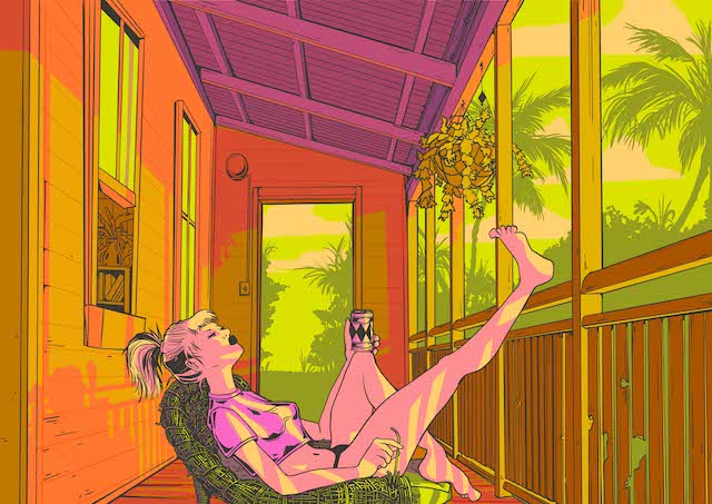
CC: One of my favourite works of yours is Sunshine City, a fake tourism ad featuring a photograph of an unapologetically unglamorous building – a windowless beige high-rise in the inner-city suburb of Woolloongabba – beneath the words ‘BRISBANE: THE SUNSHINE CITY’. What made you bring together these seemingly disparate elements: a brutalist monolith and the classic Brisbane ‘Sunshine City’ moniker?
PP: Ha ha, yes! Yes!! Deep cut. I’m so glad you like this one – she’s my accidental magnum opus. Around 2021–22, I was struggling to find photo reference imagery of some of my favourite brutalist/modernist buildings that Brisbane is begrudgingly known for. I discovered the TAB Building in Albion was earmarked for a partial demolition, so I began this frenzied work of documenting so-called ugly buildings around the city that had uncertain futures – truly a personal project that wasn’t meant for anything more. I posted the photo online and the response was enormous – the poster design really started out as an in-joke, and I’m genuinely surprised but very pleased by how many people went with it. These posters seemingly live on the back of every share house toilet door around Brisbane: my legacy.

CC: Around 2020, your illustrations of Queensland houses began to take on a surreal and slightly dystopian aesthetic: you depict these iconic buildings rising out of flood waters or forming their own complex, tree-like root systems. What prompted this shift? How does it reflect the ways in which you think the city itself, and the experience of living here, is changing?
PP: I think aspects of my work have always had a bit of an apocalyptic-science-fiction/Escape from New York vibe to them, with my ’80s street punks and crumbling suburbia, but this was certainly exacerbated by…everything. If those years of fires and floods and political crisis didn’t impact the way I expressed myself artistically, I’d be a little concerned about my ability to engage with the world around me. I’ve always liked to explore the tension between our built and natural world here, but there’s never been a more obvious time to suspend disbelief and speculate wildly about an uncertain future.
Feature image: Phoebe Paradise, A moment
Share article
About the author
Phoebe Paradise
Phoebe Paradise is a multidisciplinary artist, musician and designer specialising in illustration, murals and public art installations. Phoebe’s practice explores the everyday poetics and...
More from this edition
Dining in
In ConversationThe intimate, private setting naturally creates a close connection between the chef and diners, making it easier for the chef to share the stories, heritage and traditions behind each dish. For diners, the cosy, welcoming atmosphere makes them feel as though they’ve been invited into a friend’s home. From a business perspective, a home-based restaurant comes with fewer overhead costs, such as rent and wages. This allows me, as the business owner, to deliver high-quality food at a more affordable price, as these expenses are not factored into the food cost.
Bellend
Poetry ‘Nice little bell, buddy,’ snipes some guy holding space in the bike lane as I nearly swipe him on my way to the shops. Low and...
Safe as houses
IntroductionSometimes, if I can’t get to sleep, I imagine I’m back in the house where I grew up... I like to go back there in my mind’s eye, conjuring the slightly crooked hallway, the doors that never neatly fit their frames, the tiny kitchen with its overwhelmingly wheaten spectrum of 1980s browns. Like handwriting on old foolscap, the more specific details have long faded with time, but the feeling remains: that ineffable sense of calm and familiarity that I associate with being home.
