Featured in
- Published 20250805
- ISBN: 978-1-923213-10-4
- Extent: 236pp
- Paperback, eBook, PDF
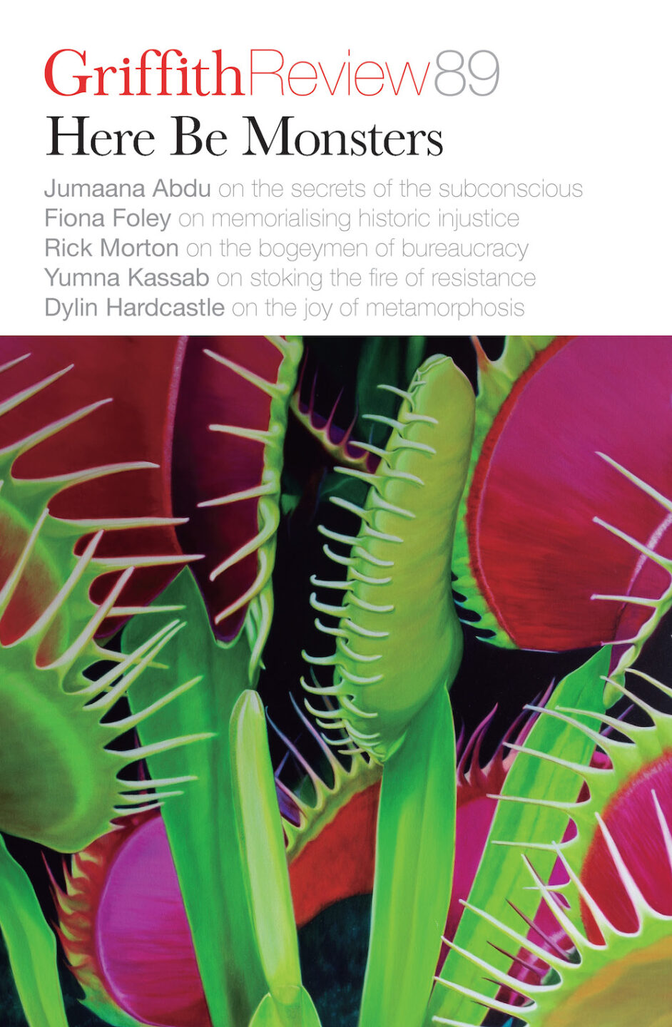
The vivid hues and spiky leaves of Jason Moad’s Temple of Venus – the arresting artwork featured on the cover of Griffith Review 89: Here Be Monsters – raises a tantalisingly sinister proposition. The subject of the painting is clear – a Venus flytrap, realistically rendered – but there’s a somewhat otherworldly quality to this plant, a sense that it might be biding its time, waiting to strike while we, the viewers, are distracted by its beauty. For Melbourne-based realist painter Jason Moad, this slippage between subject and object, reality and imagination, is part of the point. His compelling depictions of everything from plants to pop culture ephemera effortlessly draw the eye, blending photorealistic detail with a surreal or offbeat sensibility. In this conversation, Jason talks to Griffith Review Editor Carody Culver about the ideas and influences that shape his approach to the canvas.
CARODY CULVER: You’re a realist painter, and the subjects you portray are incredibly varied, from botanicals and museum artefacts to paperback books and old-school children’s rides. What draws you to paint a particular object or series of objects?
JASON MOAD: Because I work slowly, the subject has to be something I’m fascinated by, not just to sustain my interest for the time it takes to complete a painting – which is often weeks– but an entire series. This applies aesthetically and thematically, because the subject is ultimately a vehicle for whatever themes I’m exploring. Sometimes a subject will suggest a larger theme and sometimes I’ll search for a subject that can speak to whatever I’m obsessing about at the time. I tend to have a very narrow focus, which is probably why I paint the way I do!
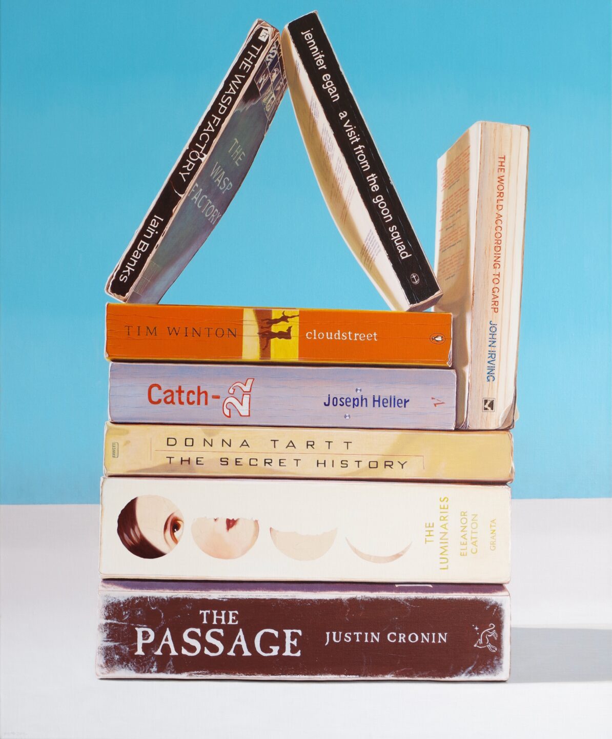
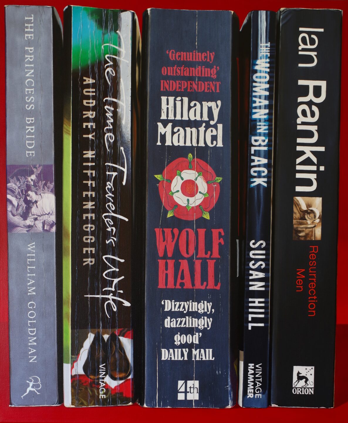
CC: Your paintings are amazingly detailed and lifelike, and they have a highly stylised quality – you often present your subjects in isolation, as though prompting the viewer to consider them through a different lens (Brave Sir Robin, for example, depicts an action figure posed for battle atop a pile of carefully arranged books). What motivates this blend of realism and art direction?
JM: In the case of the book paintings, it seemed like the natural approach. I had the books in the studio, and I’d try to arrange them in an interesting way both visually and narratively. At that time, I was totally invested in the ‘thingness’ of them as objects; a vague notion I discovered that describes this is ‘quiddity’. I called that series Physical Media because I started it in response to the creeping digitisation of culture, what with e-books and music streaming. It seemed that everything was becoming more ephemeral. Those painting were almost designed as portraits of actual objects, which might account for the effect you mention. The subjects were usually isolated, backgrounds eliminated, as you might see with a regular portrait. I’m still a physical media guy. I buy CDs and use a modded iPod. I’m very tactile. I don’t feel like I own it if I can’t hold it in my hands.
CC: What’s your process like? Do you usually go through several iterations of sketching and/or arranging objects before you land on the right composition?
JM: With the still life paintings, there’s a lot of fussing to get the composition just right. Subjects that I’ve had to find outside of the studio, like the botanical works (most of which are in the Royal Botanic Gardens here in Melbourne), require a lot of time taking reference photos – from different angles and in different light – that coalesce into the final image on the canvas. They’re synthetic, in that sense. I’m not a slave to strict accuracy, not afraid to make whatever changes I have to in terms of palette or composition in service of making a painting.
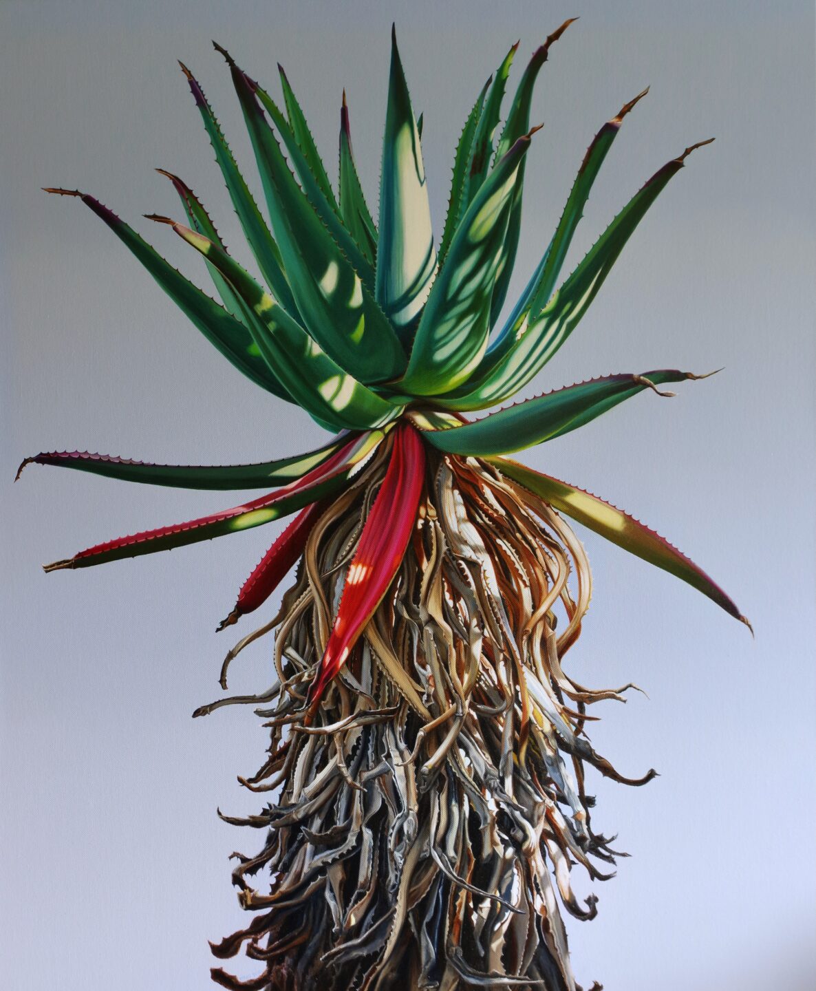
CC: The beautiful painting that adorns our current Griffith Review cover, Temple of Venus, is one of several works you’ve created that feature plants. These paintings often present their botanical subjects in bold colours – hot pink, blood red, deep blue – and situate them against plain backdrops, accentuating their elegant shapes and kinetic quality. Why did you decide to capture plants in this strikingly surreal way?
JM: I was intent on upping their sense of presence. I wanted them to project personality because that’s not an approach you often see and not the way people tend to look at plants. Botanical art can lean towards the purely decorative. I wanted my paintings to subvert that and maybe even be a little sinister, a little uneasy.
CC: Does the fact that plants are animate entities – versus the inanimate objects that appear in your other paintings – change the way you approached painting them?
JM: Philosophically, it certainly did. By the time I came to paint the botanical works, I still approached them as portraits (in the same way I tackled the Physical Media paintings) but of subjects, rather than objects. It’s a subtle distinction. I consider myself an animist, a position I arrived at after I’d already made Physical Media. It’s tricky because Physical Media railed against ephemerality at the expense of real objects, but the botanical works are almost trying to accomplish the opposite. There’s so much research around plant agency, the fact that they have their own agendas and, in some cases, even memories. Those pictures were my way of exploring the other-than-human – the fact that we live in a world full of people and only some of them are Homo sapiens.
CC: Back in 2020, you began exploring the idea of creating your own tarot deck. (As a lifelong tarot enthusiast, I love this!) I understand that you got your first tarot deck when you were thirteen. What appeals to you about the tarot – not just the imagery, but the divination element – and how are you reimagining the visuals for your own deck?
JM: I started it back in lockdown, finished maybe six or eight cards and became so overwhelmed by the scale of the project (it will require eighty-odd paintings) that I just went on with something else. I picked it up again earlier this year and made the decision to work on one suit at a time, which has made it seem more manageable!
Divination is a difficult subject to talk about. There’s a trend to focus on tarot as a purely psychological tool for self-development. It can absolutely be that, and often when I pull cards it’s to help me understand what I think about something or how to approach a situation, in which case the images on the cards can work something like a Rorschach test. But anyone who has spent time with tarot has to cop to how uncannily prescient it can be. I subscribe to a philosophy called analytical idealism, expounded most prominently by philosopher/computer scientist Bernardo Kastrup. It dovetails neatly with what cognitive psychologist Donald Hoffman and his team are describing with game theory and what Carl Jung had to say about the unconscious. I think base reality, whatever that might be, is nothing like we perceive it to be. I think the mechanism by which tarot works is probably something like Jung’s concept of synchronicity.
I’m also fascinated by the history and art of tarot. My own deck is going to be pretty idiosyncratic. It’s largely based in the Waite-Smith tradition (the deck that most people are probably familiar with, first published in 1909). I’m also drawing on influences from other cartomantic systems, going all the way back to the earliest complete tarot we have, the Sola Busca, painted in the late 1400s. At this point, I’m calling mine The Tarot of the Included Middle, which is a response to narrow Aristotelian logic and the duelist binary thinking we’re addicted to.
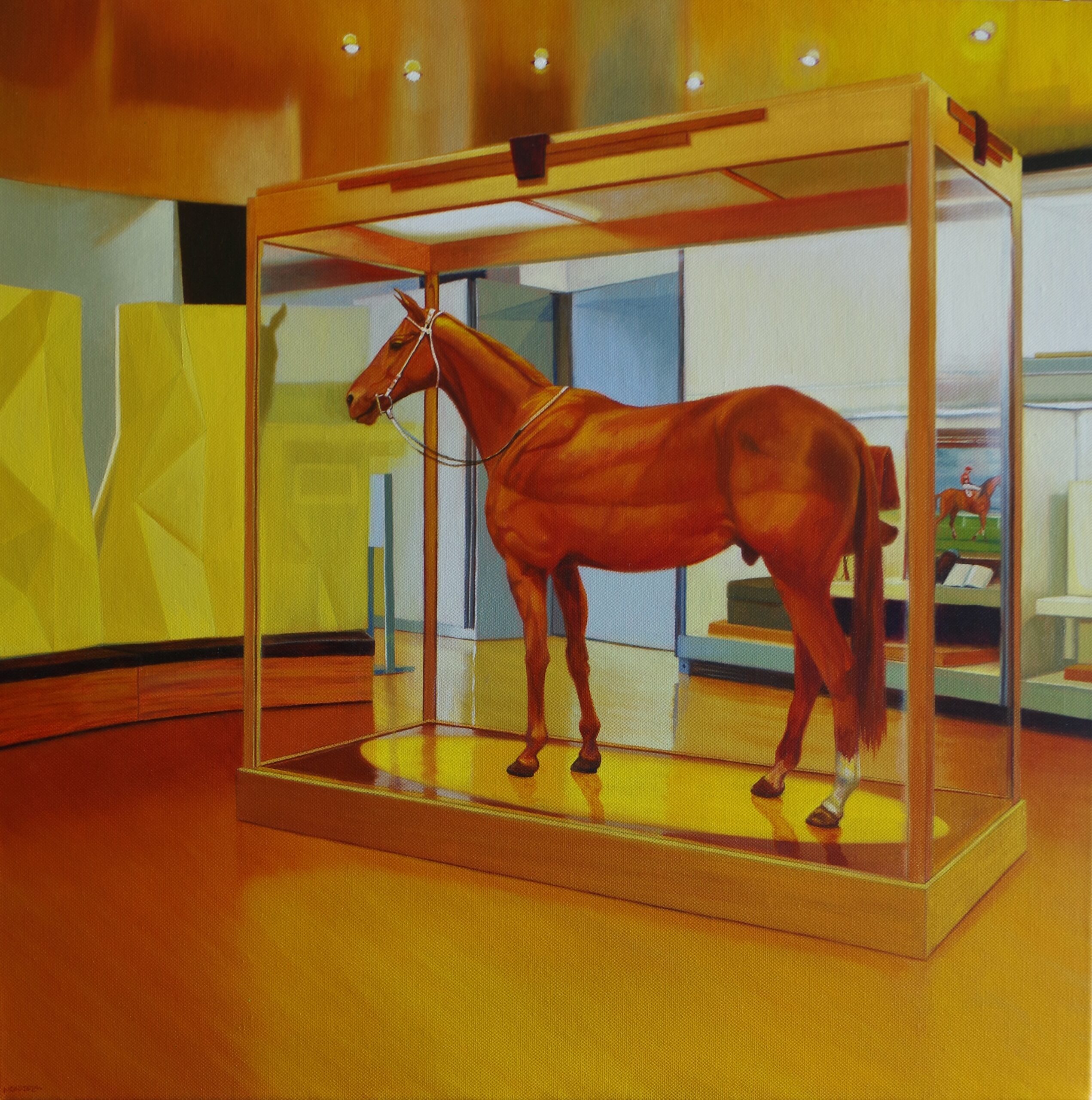
CC: A number of your works also feature museum exhibits: After That Nothing Ever Really Hurt Again shows Phar Lap in the Melbourne Museum. I Told My Friends Some Things Were Good shows a taxidermied Tasmanian tiger. It’s Never Been Hard to Pretend shows the mounted head of a great white. I love the meta quality of these works – still life of still life, if you will. Why is the museum a place of creative insight and inspiration for you?
JM: Museums are a theme I keep returning to, partly for the reasons you just outlined but also as an examination of that post-Enlightenment thinking I was just talking about. I’m torn because I’ve loved museums since I was a little kid, but that (often colonial) impulse to take something (often a creature) out of its environment and context, stuff it, mount it and stick it in a glass case sometimes strikes me as a bit perverse. I try to return some dignity to the exhibits I paint while also portraying them as kind of haunted. When I’m at the Melbourne Museum, I always spend a bit of time with Phar Lap!
Share article
About the author
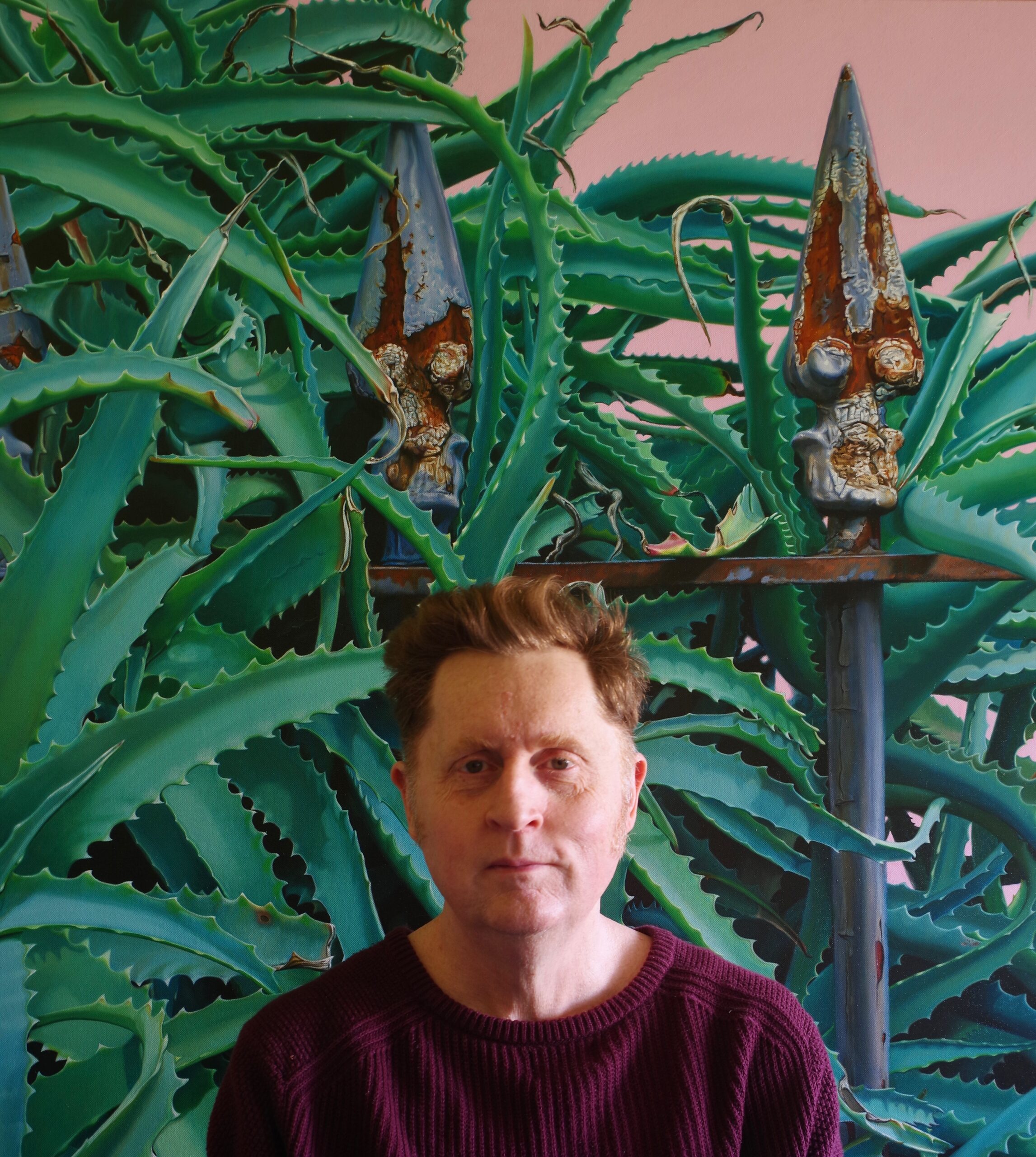
Jason Moad
Jason Moad is a painter based in Melbourne. His work deals with the ephemeral; whether presented by the vanishing world of our physical cultural...
More from this edition

victoria pedretti is my sleep paralysis demon
Poetry act one i try to write a happy poem but i am bed rotting, watching...
Gallows humor
Fiction THE TOWN’S FLOWERS have set seed in the late-spring wet hot air, as the land prepares for the rains. It is nearly hatching time...
The Mountain
Fiction STANDING HIGH IN the landscape, the Mountain has always been there. Listening, watching, teaching, arranging the flow of the winds, giving life and sustenance...
