Featured in
You’ll look twice at the artwork featured on the cover of Griffith Review 88: Culture Vultures. Up close, Samuel Tupou’s Red Sunnies is an arrangement of coloured dots floating together in a hazy approximation of form. Take a few steps back, and those disparate elements coalesce into a distinct and striking image: a man in a pair of red sunglasses. This dual perspective is characteristic of Tupou’s work, which draws on pop culture, nostalgia and family heritage to explore the vicissitudes of memory and identity. In this conversation, Tupou talks to Griffith Review Editor Carody Culver about the patterns and preoccupations that underpin his practice.
CARODY CULVER: Your work features a striking mix of historic and modern influences: you draw inspiration from traditional Pacific Island Tapa cloth design and old family albums and from the 8-bit aesthetic of ’80s arcade games and the low-res memes of contemporary internet culture. What’s the conceptual thread that connects all these different elements in your artistic practice?
SAM TUPOU: Time, place and identity are concepts that can be found in most of my works. In the early 1970s, my father moved to New Zealand from Tonga. He was part of the larger wave of Pacific Islanders who migrated to New Zealand, Australia and the United States, seeking work opportunities and the chance to start a new life in a new country.
My practice draws heavily on this period of the ’70s and ’80s. I think all recent migrants feel the weight of trying to fit in, and while my father always proudly retained his Tongan identity he also quickly adopted the Western influences of his new country. As a result, the transference of his cultural knowledge during my childhood was limited. When he passed away in the late ’90s, I began really questioning my connection to culture and my place within a much larger history of people moving throughout the Pacific region. The use of pattern in my artwork is inspired by Tongan ngatu and more broadly Pacific Island tapa cloth design. Incorporating these patterns into stories of contemporary life is an attempt to reconnect with my Tongan heritage while portraying my own everyday realities. I’m interested in making work about the convergence of cultures, acknowledging the pressures of assimilation while looking at how culture can morph and adapt in new adopted homelands.
CC: You often work with found imagery such as old photographs and tourist brochures, transforming them into brightly coloured scenes featuring oversized pixels and recurring patterns. What qualities do you look for in an image that you choose to transform into an artwork?
ST: My memories of growing up in New Zealand and Australia are a technicolour whirl of cartoons, comic books, science fiction and arcade video games – I guess I’m instinctively drawn to imagery of that era. I love using readymade imagery as a starting point for my artwork. Sixties Pop Art taught me the joys of subverting the mundane and incorporating everyday imagery not necessarily intended to be viewed as art. I look for images that can help evoke a nostalgic response, whether they’re old family photographs or printed media, things like vintage books and magazines, old records, advertisements or product packaging. By weaving this found imagery into my work I’m looking to add a layer of historic context as well as create a sense of tension when overlayed with traditional Polynesian patterning. I think this sense of contrast and contradiction is what best sums up my arts practice and describes my own life experience.

CC: You’ve described your artworks as ‘time capsules for the future’. I love this – it perfectly captures their retro-tech aesthetic, and the way they embody a nostalgic sensibility in both form and content. What appeals to you as an artist about the notion of nostalgia and how it can distort our memory and perception?
ST: Time is a twisting snake, never-ending but also cyclic; when looking back in time, sometimes you can catch a glimpse of the future. Humans have always been fascinated by the past, and I think using nostalgia as a device in my artwork is not so much about romanticising the past but instead as a way to help explain the present. When I’m looking back at these family stories and historic imagery from the ’70s and ’80s it’s with present-day realities in mind. I’m thinking about how life is today for me and my family as well as pondering possible trajectories – what life might be like for my kids and future generations.
CC: Technology and popular culture also loom large in your work, and I’m interested in how you see the relationship between these and the more historic inflections of your art – the family stories and cultural heritage. What does your work reveal about the influence of technology on our ability to remember the past and imagine the future?
ST: In the ’80s I remember going to the school library and being captivated by these ‘world of the future’ books that portrayed the future as this utopian paradise of flying driverless cars, helpful robot assistants and cordless video phones. The rise of technology has turned many of these predictions into reality, but it’s not all sunshine and lollipops. Technology hasn’t really solved all of humanity’s problems like we imagined but has added new layers of complexity to those problems.
Anyhow, things keep rolling forward – like the Steve Miller Band lyric says, ‘time keeps on slipping into the future’. Perhaps one day technology might find a way to bring people closer together and create a more empathetic society. In traversing cultures, my work attempts to acknowledge that the world is made up of multiple truths and perspective is everything.
CC: You specialise in screen printing – what drew you to this medium? How does it allow you to play with the visual effects that make your work so distinct?
ST: I was pretty fortunate, really – I grew up in a small town in Arnhem Land, and my high school art teacher, Leigh Richardson, happened to have a background in screen printing. He showed me the basic principals of serigraphy and I was quickly captivated by the technique. Some years later, when I was researching tapa cloth, I found so many parallels to printmaking and screen-printing. In particular, the relief printing technique used to decorate Tongan ngatu, which involves a pattern board called a kupesi being used to make repeated impressions on the bark-cloth prior to painting.
Colour and pattern are central to my practice and screen-printing is the perfect medium to explore both these elements. It’s an extremely versatile process that allows me to layer imagery from various sources, and I love the flatness of colour it achieves.

CC: We’re very excited to have your beautiful 2016 work Red Sunnies as the cover of Griffith Review 88: Culture Vultures. I’d love to know the story of the image – was this once a family photo? What prompted you to transform it into a piece of art?
ST: Back in 2007 I was doing a residency at Campbelltown Arts Centre and was trying to find a way to screen-print a large-scale artwork based on an old family photograph. The digital image was a very low-resolution file, and I wanted to produce the work onsite without having to use multiple oversized silkscreens. I had a hunch there was a way to make the work by separating the image into large halftones – I just couldn’t quite work out how to do it at the time, so I ended up using a digital print process instead.
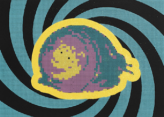
In 2016 I came back to this idea, I think motivated by the increasing mass flow of imagery permeating the internet. Also, screen-printing can be a very rapid technique, and I was looking for a way to slow down the way I approached my practice, including how the artwork was created and how it could be viewed. Using divisionism, pointillism and photographic mosaics as inspiration, I figured I could pixelate any photograph into a limited number of solid colours, print a grid and then hand-paint each pixel to re-create a version of the original photograph.
Red Sunnies was the first artwork I completed using this technique – it was basically a test to see how the process worked. I just used a picture on my phone: a candid photograph of myself wearing a pair of red sunglasses, taken when I was living in Cairns. I’ve since used this pixelation process repeatedly to create artworks and murals; many of these works were based on family photographs that my grandfather shot on slide film in the ’60s and ’70s.
CC: There’s a literal double vision at play in works such as Red Sunnies – up close, these pixelated pieces seem like abstract arrangements of shapes and colours, but from a distance they assume a distinct form, like one of those magic-eye pictures everyone was obsessed with in the ’90s. What effect do you hope this double vision has on viewers?
ST: I could never get those magic-eye images to work, but I do love optical illusions. Whenever I see a lenticular artwork, I’m always super excited about the interactive relationship with the viewer. I’m also a big fan of Victor Vasarely, Bridget Riley and op art in general. In a world of high-resolution everything, I really like that these works are absurdly low resolution, in many cases 1dpi [one dot per inch]. Up close the paintings appear to be a random assemblage of solid block colours – the abstraction achieved by using oversized pixels is reminiscent of 8-bit computer games. But at a distance, the colours blur together to create a ‘ghost’ of the original image. The intention is to portray the feeling of a faded memory: the image is hidden under a veil of pixelation and you have to kind of mentally squint to reveal the forms and figures of the original composition. When I look at the paintings I have a slightly different experience – I have the original photographic image stored somewhere in my mind, and when I see the painting, my memory recalls the photograph and helps fill in the blanks to re-create the moment in time.
For the viewer it’s a more oblique experience: they usually haven’t seen the original photograph and don’t know the subject, but I think the lack of figurative detail enables the viewer to also look for and find their own stories and blurred family memories.
Headline image: Samuel Tupou, Saturday Night Snail, serigraph on paper, 50 x 40 cm, 2020
All images courtesy of Onespace
Share article
About the author

Samuel Tupou
Samuel Tupou is a Queensland-based artist who specialises in creating vivid artworks that respond to his Tongan and Polynesian heritage, incorporating patterns derived from...
More from this edition
